 DASAPT
 Xinren Chen
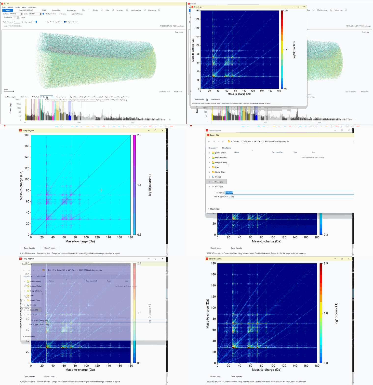
A Saxey diagram is a two-dimensional histogram of ions that reached the detector on the same pulse. Each count is one pair: the mass-to-charge ratio of one ion on the x axis, and of its partner on the y axis. Both orders are plotted, so the figure is symmetric about the diagonal.
What the pattern means
Ions that leave the specimen independently still produce counts. A common species paired with many different partners makes a horizontal or vertical band. Pairs of the same mass-to-charge sit on the diagonal.
The signal that matters is the set of events that are not independent. A molecular ion can leave the surface and then break apart in the standing electric field. The two fragments do not both keep the flight time of a free ion of that mass. Coulomb repulsion, and the distance at which the bond breaks, shift the measured flight times. On the diagram those events leave the crossing of the two fragment peaks and run out as a curved track, often called a tail. Dissociation close to the tip stays near the true fragment masses. Dissociation later in the flight, after the pieces have already been accelerated together, runs toward the mass of the intact parent ion.
An empty background is therefore not the expected picture. The faint tracks away from the integer peaks are the dissociation signature. Saxey introduced this correlation histogram for multiple-ion events. Blum and co-workers later measured how that dissociation changes both flight time and detector position, which is what pulls the tracks off the peaks.
In APT Calibrator
- Load an
.eposor.aptfile. A.posfile has no pulse multiplicity, so it cannot make this plot. - On the mass-spectrum bar, click Saxey diagram.
- Drag a box to zoom. Double-click to reset the axes.
- Right-click for the color bar, color range, axis font, copy, or export (image, CSV, or layered PDF). Color is log10(count+1). Empty bins keep the bottom color.
- Open X peaks and Open Y peaks draw the current RRNG ranges on the two axes.
If a cube, slice, detector, or ion-range filter is on, the diagram uses that selection. Clear the filter to plot every multiple-hit pair in the file.
References
- D. W. Saxey, Correlated ion analysis and the interpretation of atom probe mass spectra, Ultramicroscopy 111 (2011) 473–479. https://doi.org/10.1016/j.ultramic.2010.11.021
- I. Blum, L. Rigutti, F. Vurpillot, A. Vella, A. Gaillard, B. Deconihout, Dissociation dynamics of molecular ions in a high dc electric field, J. Phys. Chem. A 120 (2016) 3654–3662. https://doi.org/10.1021/acs.jpca.6b01791
Saxey 图是同一次脉冲里到达探测器的离子对的二维直方图。横轴是其中一个离子的质荷比,纵轴是另一个。两种顺序都会画上,所以图形关于对角线对称。
图上的图案
彼此独立蒸发的离子也会有计数。一种常见离子和许多不同伙伴配对,会形成水平或垂直的条带。质荷比相同的离子对落在对角线上。
真正有用的是那些并不独立的事件。分子离子离开表面之后,可能在静电场里断开。两个碎片的飞行时间,不再等于它们各自单独蒸发时的飞行时间。库仑排斥,以及断键发生的距离,会改变测到的飞行时间。在图上,这些事件离开两个碎片峰的交叉点,拉出一条弯曲的轨迹,也就是常说的 tail。断键若发生在针尖附近,轨迹靠近两个碎片的真实质荷比。断键若发生得更晚,两个碎片已经一起加速过一段,轨迹会朝完整母离子的质量延伸。
所以背景不该是一片空白。离开整数峰的淡轨迹,就是解离的标志。Saxey 提出用这种相关直方图来看多次击中。Blum 等人随后测量了解离如何同时改变飞行时间和探测器上的落点,轨迹就是这样被拉离峰位的。
在 APT Calibrator 里
- 载入
.epos或.apt。.pos没有脉冲多重度,不能做这张图。 - 在质谱那一栏点击 Saxey diagram。
- 拖一个方框放大,双击恢复坐标。
- 右键可以改色标、计数范围、坐标字体,或复制、导出(图片、CSV、分层 PDF)。颜色是 log10(count+1),空格子用色标底部的颜色。
- Open X peaks 和 Open Y peaks 把当前 RRNG 范围画到两条轴上。
如果开着 cube、slice、detector 或离子范围过滤,图只用当前选中的离子。清掉过滤后,文件里每一对多次击中都会画上。
参考文献
- D. W. Saxey, Correlated ion analysis and the interpretation of atom probe mass spectra, Ultramicroscopy 111 (2011) 473–479. https://doi.org/10.1016/j.ultramic.2010.11.021
- I. Blum, L. Rigutti, F. Vurpillot, A. Vella, A. Gaillard, B. Deconihout, Dissociation dynamics of molecular ions in a high dc electric field, J. Phys. Chem. A 120 (2016) 3654–3662. https://doi.org/10.1021/acs.jpca.6b01791
0 comments
Sign in to comment.